Post processing techniques and ressources for Adobe Photoshop Lightroom, Google Nik Collection… and more to come! Processing fans, this one is for you!

What are Lightroom’s Smart Reviews

Adobe’s Lightroom is a fantastic piece of software. It may not be the best photo editor (Capture One for example is still the reference IMHO), it may not be the best to organise your photos (Photo Mechanic is pretty awesome too), but it does all of that very well, and furthermore it offers so many features that makes the photographer’s life easier.

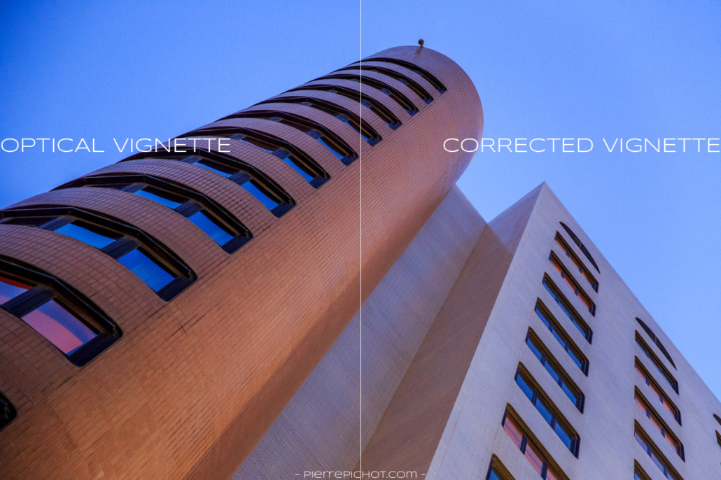
The last example I have is Smart Previews. I must say I’ve discarded them as soon as they appeared. Imports are already long enough, between copying the photos to the hard drive, generating the previews… Who cares about another kind of preview? They are actually smaller DNG files created after the original RAW files and that keeps all their flexibility, except with a lower resolution and therefore a lesser MB footprint. Their usage became clearer to me when I started using Lightroom Mobile: it synchronizes Smart Preview over Adobe’s Creative Cloud in order for the Mobile App to work with. It’s become quite useful, but my older and slow iPad and my small iPhone are not the best tools for retouching. And Lightroom Mobile doesn’t offer (yet) all of Lightroom’s features such as the local adjustments. So, that was it. Until 2 weeks ago.

Let’s be Smart

Because I’m a lazy kind of guy, I still have a bunch of travel photos from last year’s trip to Japan that I still have to touch. Being on a business trip for a few days, including a LOT of time in the place, let’s use this time for clearing a few hundreds of remaining photos. But I need unrestricted access to all of Lightroom’s features of course, so no Lightroom Mobile work. And I don’t have enough space on my laptop’s hard drive, so no way I’ll copy GBs of photos on it, or use a slow like hell external drive. That’s when I remembered those little Smart Previews, and how they can help me having access to all my Japan photos without too much precious space used, and fast access too. Let’s give it a try!

So for sharing photos between 2 computers you need:

  • 2 computers:
    • The “source computer”, that holds your main Catalogue
    • The “target computer”, that you’ll use to work remotely on your photos
  • Lightroom installed on each computer, preferably the very same version, at least the same major version (e.g. Lightroom 6.x)
  • An external drive, or a shared drive on your network
  • A bit of time 🙂

Going remote

Here is the thing:

1. Save the photos’ metadata to a sidecar file on the source computer.You may have already a standard preset when importing photos into Lightroom, as I do. You also may have some already retouched photos that I could use as a reference. So you want to keep all the changes that have been done until now. The best way is to save all the development metadata to XMP sidecar files. Those are XML files that contain all the changes you do on your photos in Lightroom. The only constraint is that it doesn’t work with virtual copies, so be careful. Ideally the photos and the sidecar files should be on an external drive, or at least a shared drive that is reachable by the target computer. So select all the photos you want to work on in the Library module, then right-click on them and select Metadata > Save Metadata to File.

Lightroom Smart Previews - Save Metadata to File

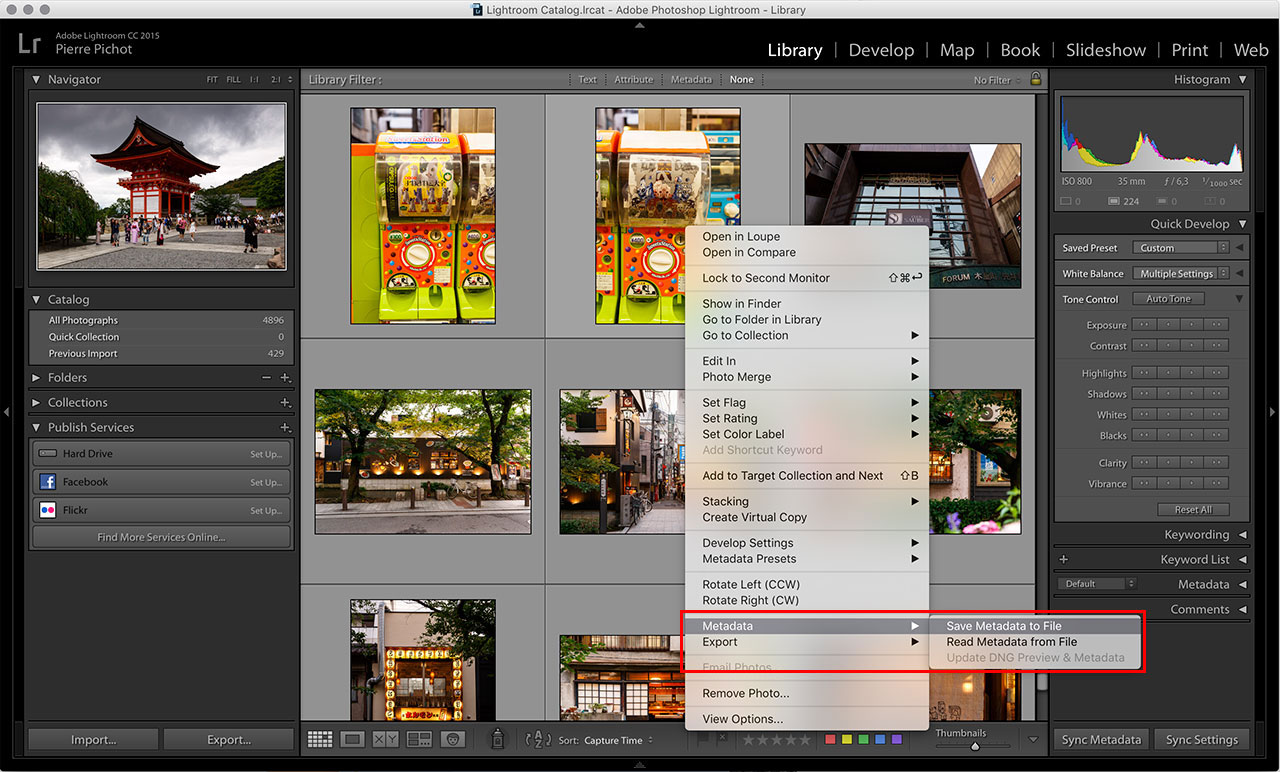
Lightroom Smart Previews – Save Metadata to File

Read more

For today’s Processing Tuesday we leave a bit Adobe Lightroom for another great tool, Google’s Nik Collection‘s Silver Efex Pro 2.

Silver Efex Pro 2 is my “go to” plugin for awesome black and white photography. Lightroom’s black and white module is quite useful, but is far from being as powerful as Silver Efex Pro. You have much more control on the contrast and the structure (+/- clarity on Lightroom), that can be global or separated for highlights, mid tones and shadows. And those Control Points… I think I’ll have to make a few articles about it 🙂

Today’s free presets, or recipes as they’re called in Nik, are my 2 favourites for Silver Efex Pro. They are pretty bright presets, that I use for street photography mainly. Let’s see how they do on this photo of an old Trabant’s “portrait”, in a very good shape, and with little hearts on the eyes:

So we have:

  • High structure: structure/clarity oriented preset, perfect for highly detailed photos.
  • High key: a highlight oriented preset, much softer than the High Structure one. Goes well for portraits.

Just click a bit down to download these 2 free Nik Collection Silver Efex Pro 2 presets, and have fun!

[wpdm_package id=’754′]

See you next Tuesday for more processing resources!

The vignette is the enemy. That’s a statement I’ve heard/read too many time. That’s not necessarily wrong, but it’s neither true. There are actually two kinds of vignette:

  • The optical vignette from the lens (or even worse: from the stacked filters in front of your lens), that you can’t control, but hopefully you can still do something about it. It’s the “bad” one, the one you usually don’t want.
  • The controlled, post processed vignette, created with your hands (well… mouse) in the way you want to make your photo even better.

Let’s focus a bit on them.

The optical vignette, aka “the one we want to get rid of”.

It’s the one people usually wants to avoid. Look at any lens review, any lens less vignette-prone will be praised. The vignette generally appears at wider apertures to disappear at smaller ones, usually after 2 to 3 stops. It happens when the lens’ rear elements are shaded by elements in front of them. We’re lucky though, with our modern RAW softwares we can just use a lens profile and get rid of this unwanted vignette. Let’s look at this shot of the Mercure Hotel in Algiers, Algeria, shot at sunset:

Mercure Hotel, Algiers, Algeria. Optical vignette example.

Mercure Hotel, Algiers, Algeria. Optical vignette example.

On the left hand side, the optical vignette has remained untouched. Look at the sky in the top left corner, how dark it become while it should stay even as it is on the corrected version on the right hand side. On the right hand side, I removed it with Lightroom, which make the whole image much clearer.

Of course, it doesn’t mean that the optical vignette is always bad. As anything in photography, one can use it in a creative way 🙂

The post processed vignette, aka “the creative one”.

Now enters the vignette the photographer adds to his perfectly-processed-for-hours photography. Usually the people I discuss with about this subject come with this question: “Are you crazy? Why on Earth would I want to add AGAIN some black corners to my photo?”.

The answer here is every time the same: “Who talked about black corner?”. Because like sugar or salt, a subtle touch of vignette can make your good photo look exquisite, but an abuse will make a mess! While there are a lot of usage for the vignette (make a photo look old, correct the exposure of the borders in an unorthodox way…) the main usage is to help the user focus on the subject but reducing slightly the impact of the borders. His eyes will naturally drift to the center where the magic happens.

Here are a few examples:

Let’s continue with our photo of the Mercure Hotel in Algiers. The first one is the vignette free version, who got its optical vignette removed at import. Next, a vignette abuse: dark corners, it’s almost night on this picture. The second one is already better: the corners are darker but not black, the transition is smoother, but it’s still pretty heavy and obvious. Last but not least, the kind of subtle vignette I like: do you see it? A lot of people doesn’t, and sometimes me neither I must say 😀 In this case, once again it’s more obvious in the sky, at the corners. But look comparatively to the first shot: nothing is lost, all the details in the corners are still here, but your attention is drawn but the center where the subject is.

The post crop vignette tool

Post-crop vignetting tool Lightroom

Adobe Photoshop Lightroom’s post-crop vignetting tool

Adobe Photoshop Lightroom, or any RAW converter software, has a vignette tool with a few sliders:

  • Amount: controls the amount of vignetting, how dark (or light!) will it be. It’s the more critical slider.
  • Midpoint: controls where the vignette will start on your picture, closer or further to the middle of the frame.
  • Roundness: controls the shape of the vignette: rounder or more square?
  • Feather: controls the transition from the middle to the border: will it be a smooth transition, or a harsh, on/off style one?
  • Highlights: saves the highlights in the vignette.

Lightroom gives 3 styles of vignette:

  • Highlight priority: the one I use 99% of the time, it makes the edges darker, but tries to save the highlights around the edges to make sure it stays bright.
  • Color priority: can be a bit more subtle than the other two, but sometimes it gives some quite saturated results. It tries to keep the colors without darkening them too much, but I don’t really like what it does, I prefer a classic vignette.
  • Paint incrustation: it makes the edges darker, quite straightforward.

But wait, why post crop vignetting tool? Because if you crop your photo, at any time of your processing workflow, Lightroom will adapt the vignette to the new format. Piece of cake!

So, how to make those fancy subtle vignettes?

Here is what I do, there are countless possibilities:

  1. I set the Amount slider around -20. It gives me the possibility to clearly see the shape of my vignette without being too dark.
  2. Then I go and play with the Midpoint and Roundness sliders to give it its final shape. Here it really depends on what’s on the photo. For example for a portrait an oval vignette is usually the way I go. If I took a shot from a door I like to have a more square vignette that matches the door’s shape.
  3. Once my shape is set, I move the Feather slider to adapt the transition on my needs: softer or harder. Sometimes you have to repeat steps #2 and #3 until you find the perfect settings.
  4. Then I go back to Amount and in 99% of the cases I reduce it in the -5/-12 range. Don’t hesitate to activate/deactivate the post crop vignette to check the effect it has on the photo.
  5. Only at this step I change the vignette style, however in the very, very large majority of he cases I just leave Highlights priority.
  6. Last, if I have some highlights I don’t want to be affected by the vignette, I roll the Highlights protect slider.

And that’s pretty much it. After some practice you’ll see that it’s a 2 minutes job that can enhance quite a lot an already good picture!

To conclude

Once again, this is how I do it. It doesn’t mean there is a standard rule, like everything in photography anything can be used in a creative way 🙂 But I’ve seen too often some great photos being penalized in competitions because of a too obvious/misused vignette. It’s a blade with two sides, be careful when vignetting.

See you next Tuesday for more processing resources!